Walmart Patient Check In
How do we help Walmart transform the medical landscape and enable their care hosts to provide a more frictionless and transparent patient experience at Walmart’s new state-of-the-art health centers?
Walmart recently opened their first health center in Dallas, Georgia, offering full medical, dental, and vision services, all under one roof. The patient checkin app is a web app that enables care hosts, Walmart’s on the floor staff, to provide patients at this new health center with a more personalized and transparent experience. By designing a completely tablet experience, care hosts are freed from the confines of a traditional check in desk and allowed to have more shared interactions with their patients on the floor. Two key goals guided our my design decisions — full price transparency, and frictionless interactions with our software.

Research
Stakeholder Interviews
I interviewed key Walmart administrators, as well as boots-on-the-ground clinicians, to find out their key goals for this application and pain points with their current tools and processes.
Onsite Walkthrough (Contextual Inquiry)
Walmart wanted to mimic the Disney ride experience of queuing up, walking through an interactive space, getting on the ride, and then exiting to the souvenir shop. The flow through the space was as important as the software that would enable this experience. We talked with the care hosts, who would be carrying tablets and guiding patients through the space, to discover key moments in time and where we needed to support them with the app.
Personas
Two primary personas presented themselves right away. Care hosts working in the space, and clinical administrators behind the scenes. Patients, by way of the care hosts sharing the tablet screen with them, were also considered primary personas.
Affinity Mapping
Along with the product team and development team, I led affinity mapping exercises to synthesize down the product ideas we heard from Walmart and from internal stakeholders. Key concepts quickly presented themselves and provided a focus for the direction of the application.
Lean UX Canvas
The lean UX canvas provided us with an artifact on the wall that would be our guiding light, helping us understand how we would differentiate ourselves from the rest of the medical space and provide real value to users of the app. It also helped us define how we would measure success of the application. I facilitated the design session and generated the end artifact.

Key User Goals
Clinical administrator:
-
“We want our patients to always know what they will be paying, even if things change during their visit.”
-
“We want the check-in process to be super easy and painless. No friction.”
Care Host:
-
"We want to know who’s next in, for what appointments, and if we’ll need to complete registration with them, which can be a speed bump in patient traffic.”
-
“We want to be able to find the appointments we need quickly so we can keep the ball rolling."
Challenges
Short development cycles
We had about 3 months to deliver the MVP product to support the grand opening of the first health center. We worked in one week sprints, which meant I had to learn and iterate quickly. Managing the meeting load and heads-down time was important.
Shared components across products
The check in app would share components and code with the sister scheduling app, adding small but significant design limitations. Both teams had to work closely together, and a light design system to be created (which would form the basis for our formal design system).
Supporting multiple service lines
These new health centers would offer full medical, dental, vision, and behavioral services, meaning our app had to talk to many different patient record systems and pricing estimation services. This had an impact on site performance and we had to watch how we load data onto the page, which played into many of the design decisions I made.
The Product - Primary Workflows

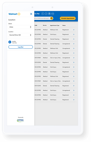
Appointment List
-
The experience starts with the appointment list, showing all appointments for the current day.
-
The list always shows the next upcoming appointment or currently checked in patients. Patients who have finished their visit will be filtered out of the list by default.
-
The care host can navigate through days using the date controls and date picker if future or past appointments need to be viewed and managed.
-
Walk-in patients can be immediately scheduled for the next opening using the Schedule Appointment button, which will redirect to the sister scheduling application.

Filtering
-
Using the filter, care hosts are able to view patients by service line (medical, dental, vision, etc.). Status of each appointment is also filterable. For example, a care host can filter the list by all dental appointments that are unregistered (patient opted out of online pre-registration).
-
Filters persist between user sessions, so care hosts primarily dealing with dental patients can always view only dental appointments.
-
A quick reset to the default list view can be triggered by the reset button.

Search
-
Using the search bar on the main appointments screen, care hosts can search for patients using the top two identifiers, name and date of birth.
-
Search results will return existing patients in the system, allowing those patients to continue and immediately check in with their previously entered information, bypassing a 5-10 minute registration process.
-
Search will show results for any combination and order of first name, last name, full name, and DOB.
-
The search results are also filterable by the most commonly used identifiers: name, DOB, location, and phone number.
-
Tapping on a patient will open their patient detail screen. Navigating back will return the previous search results, in case the correct patient was not pulled up.
Patient Detail - Unregistered State
-
The patient detail screen presents patient information in the left rail, and appointment details on the right.
-
At this point, check in is not possible, but the ability is hinted at by the disabled Check In button state.
-
Registration is made easy to complete (if not pre-registered) alongside the patient through a hub-and-spoke navigaton model.
-
Each piece of registration information is represented by a card view.
-
Care hosts, side-by-side with the patient, can view the screen and complete registration by completing personal demographics, financial info, insurance, and consent forms.
-
Incomplete cards will be marked by an incomplete affordance. The opposite is true when the card is completed.
-
The cost of the visit without insurance is visible below the appointment details with a breakdown of procedures.


Financially Responsible Form
If not the patient, the info for the person responsible for paying may be collected here. Information here will be retrievable by the insurance forms.

Insurance Forms
Primary and secondary insurance info can be collected here for the financially responsible person defined previously.

Consent Forms
The care host can collect consents for treatment, billing, and privacy. Consent verbiage can be accessed and dictated by the care host, or read by the patient on the same tablet.

Patient Detail - Registered State
-
Once all of the registration information is completed, the patient is considered registered, at which point the Check In button is enabled.
-
If insurance information was entered during registration, the cost estimate will now include the cost with and without insurance for full pricing transparency and easy comparison.
-
If insurance details are updated or edited, a new call to the estimation service will be made and updated estimates shown in the cards.
Patient Detail - Checked In State
-
Once the Check In button is tapped, and after going through a quick verification step to make sure all information collected is accurate, the patient is then considered checked in.
-
The appointment can still be cancelled or rescheduled even after check in.
-
If any additional services are performed during the visit (e.g. x-ray is taken), the estimate will be updated. All costs will be accounted for so there are no surprises.
-
When the patient is finished with their appointment, the care host may access the Check Out button, which will launch a separate check out experience.
-
The care host may additionally schedule new appointments for the patient via the button in the header.

The Product - Secondary Workflows

View Upcoming Appointments
Future appointments can be viewed from the patient details screen via the Upcoming appointments tab. Appointments can be managed and estimates viewed.

View Past Appointments
Past appointments may be viewed one year at a time and filterable by service line. Information is presented in descending order, showing the most recent first. Months can be expanded upon to show days with appointments.

Patient Notes
Patient notes can be accessed via the nondescript notes button next to the Patient Information header. Notes can include clinical information, or be used to inform other care hosts about the appearance and location of a patient inside of the health center. Notes can be flagged as urgent, in which case the note will be pinned to the top of the Notes modal.
Navigation Drawer
Logout and future location switching are located in the navigation drawer. Location switching will allow the care host to view the appointments for another health center location.
Learnings
-
Based on analytics from our business intelligence team, we have seen that about 75% of patients prefer to complete registration in person rather than use our online pre-registration solution. This has shifted our focus into optimizing and improving the registration process in the check in app.
-
The same analytics have shown increased time-of-service payments, which we attribute to the pricing transparency.
Project Details
My Role: Product Designer, UI Designer, User Researcher, Design Studio Facilitator
Team: CEO, PO, 4 app developers, 2 testers